9 top trends UI interface design in 2021
From this year's design, we can see that the design is more rational and restrained , applying gradient colors to key functions and highlighting important information.
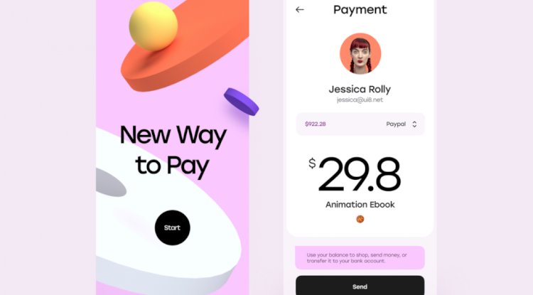
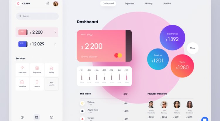
1) a small amount of gradient
This year, I saw a large area of gradient design on various websites. Compared with the previous two years, there are fewer and fewer designs. The design has been restrained. Although the large-area gradient colors have strong visual impact, most of them stay in the concept.
From this year's design, we can see that the design is more rational and restrained , applying gradient colors to key functions and highlighting important information.

In the ticket purchase interface, the gradient color is applied to the head position to emphasize the function.
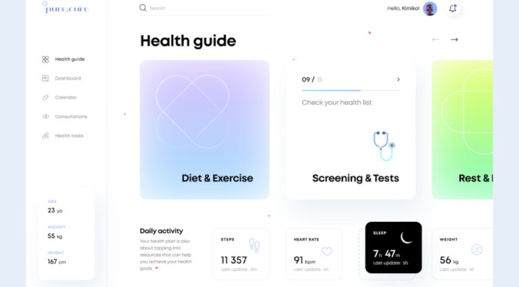
Use it on function cards to highlight key information.
")
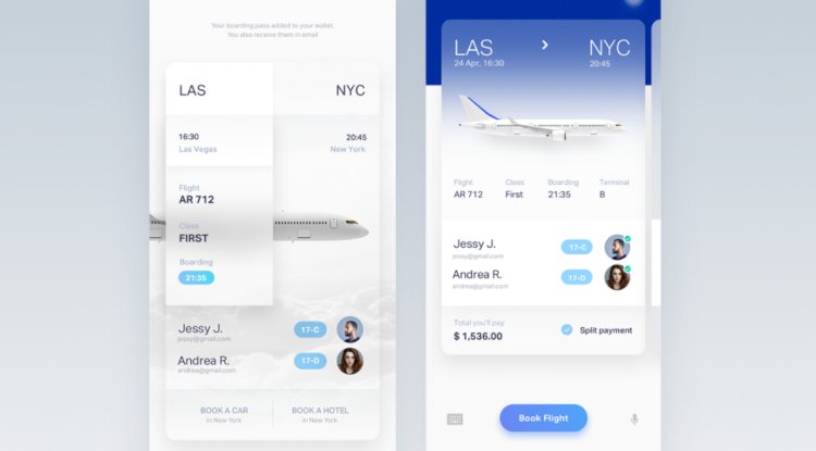
As shown in the picture above, the design also only uses gradient colors on the background, and there are basically no gradient colors on other cards.
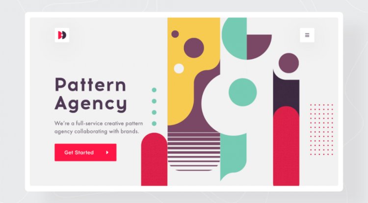
2) Bauhaus style graphics
Geometric graphic design is currently the most used design technique. This year, some more abstract artistic Bauhaus-style geometric figures have been used extensively in UI design , and the effect is not bad.
The advantage of this kind of graphics is strong memory and wide application. It can not only be extended in brand packaging and brand graphics, but also can be used in UI design.

The card design uses some graphics with intentional symbols to express the design of functions and form memory points.
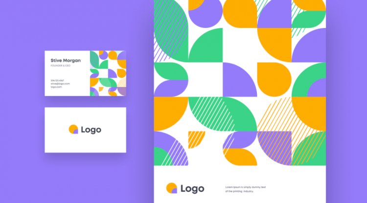
In the brand design, this minimalist Bauhaus style geometric pattern is also repeated. The logo elements were extracted, Bauhaus stylized, and reused in the design.
3) Deep interface
This year, such designs are not uncommon. A large amount of 3D is used in interface design, and the two-dimensional interface no longer meets the current design needs. Designers explore the integration of more dimensional disciplines and UI interfaces to form a new visual sense.
The concept website of uber is presented in 3D, expressing the highlights of functions.


Making the two-dimensional world three-dimensional will be an important trend in 2021. At present, there are some products online at home and abroad, which are beginning to use this design technique in some functional modules , such as Naver and Alipay.
4) Frosted glass effect
It can be said that it is a trend cycle, and the effect of ground glass is back. This is also a design that has appeared more frequently in various website designs this year.
The new frosted glass effect pays more attention to the function description and is used in the place of visual emphasis .
Designed as shown above, ground glass is used on the key information at the top . This design can reduce the use of other colors, and can also emphasize functional information.

The frosted glass effect is applied to the personal center and the position of the avatar to emphasize the design.


Using frosted glass to package the UI interface can enhance the sense of quality and mystery.
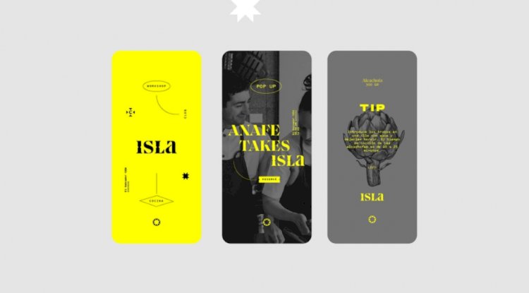
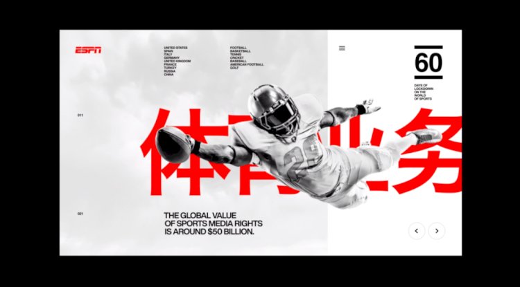
5) Immersive interface
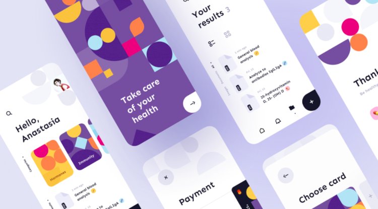
Integrating functions and scenes into design , users can generate more experience and experience in the process of using the product. This is also a popular design idea recently called this year. On various websites, this kind of design appears more and more times, the design effect is strong, and it is recognized by many designers.
The key character elements and design in the scene are cleverly assembled.
Use surreal design techniques to layout the characters and hotel scenes.

Combine production materials and products.

The immersive plant elements and the land are cleverly assembled to convey realistic effects visually.
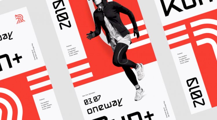
6) Magazine layout of interface
The magazine design style is clear, which can help the product to create an enhanced memory point. The advantage of magazine design is that it is not restricted by the grid, the typesetting uses large fonts, and the design and typesetting are more personalized . We are in the early stage of product concept exploration, so we can try this style more.

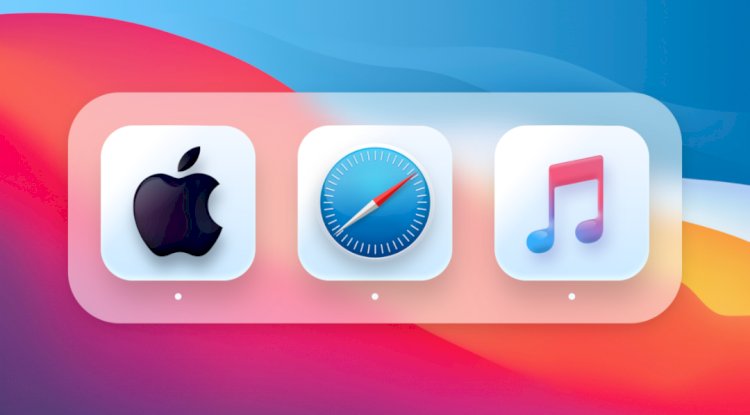
7) Pseudo-materialized icons
The mimic icon is back again. Apple's new version of Big Sur system uses mimic icons. This is also a new attempt, and of course it is also a beginning. It is very necessary for us to pay attention to this trend at all times, and we will see the emergence of pseudo-materialized icons in more designs in the future.
However, this style can not be used in a large area in the interface, we can use it in the design of some key functions.

The use of weather, compared with the previous flat design, the current pseudo-material design with space, increases the sense of reality.


8) Use of Circle
The circular trend, I think everyone may ignore the point, in the design in recent years, circular design is everywhere. Its benefits are self-evident, strong affinity, wide scene coverage, and almost any design can use a circle. Therefore, we need to pay attention to the circular application skills.
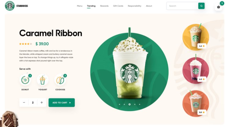
Starbucks' web UI concept design uses circles and products for integrated design and layout.
9) 2021 New Mimic Interface
The new mimicry trend is one of the trends that will receive widespread attention in 2020. This trend uses a large number of soft shadows and faint gradients to make the design both futuristic and realistic , and brings a new feel to the familiar interface. Compared with the previous large-area thick shadows, the current new simplified mimic interface will restrain the use of these elements.
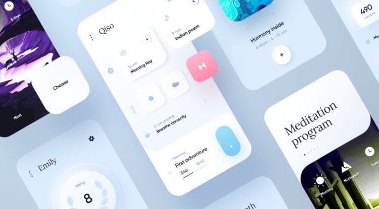
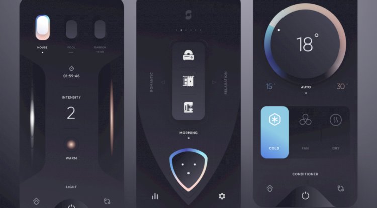
In 2021, the mimic interface will focus more on functions and experience. Mimic effects will be used on key functions, such as meters, buttons, or places that need to be emphasized, avoiding large-scale use of this design technique.
What's Your Reaction?